


Table of contents

No headings in the article.
CSS Grid: A Comprehensive Guide
CSS Grid is a powerful layout tool that allows web developers to create complex grid layouts with ease. Unlike the traditional CSS layout methods such as floats and positioning, CSS Grid is designed to create two-dimensional layouts, making it perfect for responsive web design. In this article,
we will cover the fundamentals of CSS Grid and provide examples of how it can be used to create stunning layouts.
Getting Started
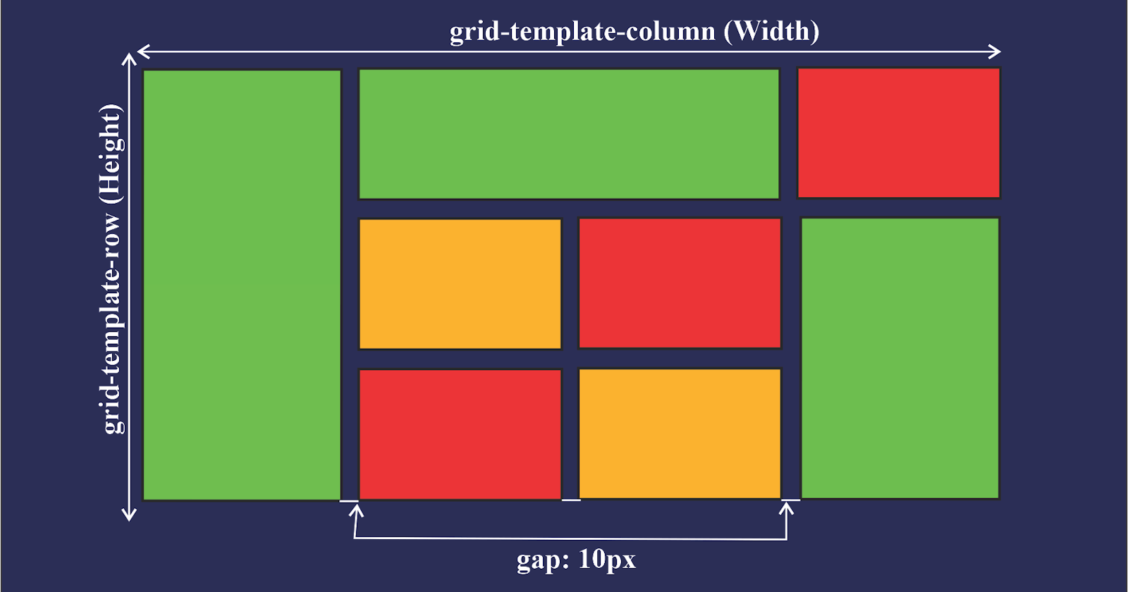
To use CSS Grid, you need to define a grid container, which is simply an HTML element that contains one or more grid items. You can define a grid container using the display property and setting its value to grid.
.grid-container {
  display: grid;
}
By default, a grid container will create a single row with a single column. To define the size of the grid columns and rows, you can use the grid-template-rows and grid-template-columns properties. For example, to create a grid with two columns and two rows, each with a width of 50%, you can use the following CSS code:
cssCopy code.grid-container {
  display: grid;
  grid-template-columns: 50% 50%;
  grid-template-rows: 50% 50%;
}
Grid Items
Once you have defined a grid container, you can start adding grid items to it. Grid items are the HTML elements that are placed inside the grid container. To position grid items within the grid, you can use the grid-row and grid-column properties.
cssCopy code.grid-item {
  grid-row: 1 / 2; /* Start row 1 and end row 2 */
  grid-column: 1 / 2; /* Start column 1 and end column 2 */
}
You can also use shorthand properties to define both the row and column at the same time.
cssCopy code.grid-item {
  grid-area: 1 / 1 / 2 / 2; /* Start row 1, Start column 1, End row 2, End column 2 */
}
Grid Lines
Grid lines are the lines that define the boundaries of the grid. You can use them to position grid items more precisely. Grid lines can be referred to by number or name.
cssCopy code.grid-item {
  grid-row: 1 / span 2; /* Start row 1 and span 2 rows */
  grid-column: 1 / span 2; /* Start column 1 and span 2 columns */
}
Auto Placement
If you don't explicitly position a grid item, it will be automatically placed according to the grid-auto-flow property, which determines how the grid items are placed when there is empty space in the grid.
cssCopy code.grid-container {
  display: grid;
  grid-template-columns: repeat(3, 1fr);
  grid-auto-flow: row dense; /* Place items in rows and fill empty space */
}
Grid Templates
The grid-template property allows you to define both the grid-template-rows and grid-template-columns properties in a single line.
cssCopy code.grid-container {
  display: grid;
  grid-template:
    "header header header" 100px
    "nav main aside" 1fr
    "footer footer footer" 100px / 1fr 3fr 1fr;
}
In this example, we have defined a grid with three rows and three columns. The first row has three header cells, each with a height of 100 pixels. The second row has three cells, one for the navigation, one for the main content, and one for the aside. The third row has three footer cells, each with a height of 100 pixels. The columns are defined using fractional units, with